 – Heatmaps of Student Activity")
Introduction
This blog post introduces an emerging implementation of learning analytics for lecturers that offers a novel approach to the visualisation of learning analytics within the Moodle LMS called the Moodle Activity Viewer (MAV). The motivation for its design was born from the frustration of using the standard analytics reporting functions available in Moodle 2.2 by lecturers at my institution. While there are many efforts underway to improve this functionality within the latest releases of Moodle, at least for my own institution, these improvements are likely to be years away from adoption. One emphasis with these improvements, is a greater use of graphs over tabular lists, most common in earlier Moodle 2.x versions.
What is MAV and How Does it Help Lecturers?
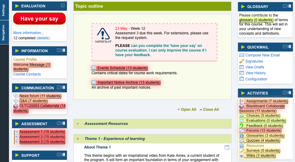
MAV takes a fresh approach to representing student activity within Moodle, by using heat maps (or click heat maps) as shown in the screenshot below:

- Heat map of Resources Usage by Students using MAV
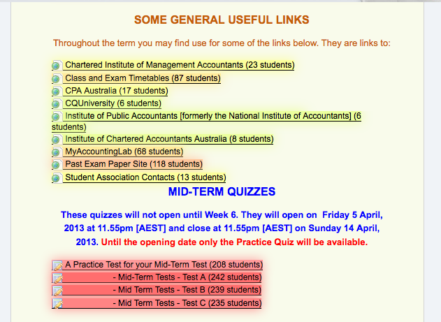
In the example above, MAV is representing the number of students who have accessed various resources and activities on a Moodle course site by colouring the links accordingly. In this way, MAV is focused on assisting with teacher reflection – identifying which elements of the course were used by the most students, and those which weren’t. On presenting the above snapshot to the lecturer, they responded: “Aaaah that’s interesting. I’m surprised that as many students as that used some of the links.” After further discussion, they shared the following comments:
I do feel that [the course] is guilty of that to some degree that we baffle them with BS and overwhelm them with far too many resources till they can’t separate the forest from the trees. I was certainly in two minds about even including most of those resource links at the beginning of the semester. I can certainly understand the results in the mid-term tests…they were compulsory
This is exactly the sort of teacher reflection that was intended by its design. Another excerpt from a Moodle page rendered using MAV from a much smaller postgraduate course is illustrated below.

- Heat map of Assessment Resources Usage by Students
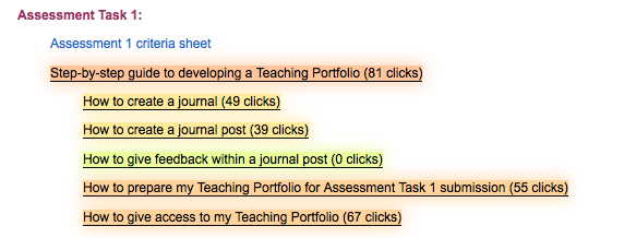
The lecturer of this course has been experimenting with MAV for a few months, and had the following to say about what changes might be made in future offerings:
… academics as students may already know and understand about the feedback resources I gave them, that is why they didn’t bother reviewing. Now I’m thinking of removing them. But in saying that, it is up to me to provide the scaffolding they require, so I’m thinking I should leave it there because it is good practice, even though I know they aren’t using it, but could potentially use it for their own students.
When asked about MAV’s ease of use:
It was very easy to use MAV to get an insight into useful resources. I
would have no idea how to get this info through normal Moodle tools and
activity reporting.
Within higher education, learning analytics is predominantly used to identify “at-risk” students with the view to prevent or limit student attrition (Chatti, Dyckhoff, Schroeder, & Thüs, 2012; Lodge & Lewis, 2012). Identifying learners “at-risk” is only one, albeit important complex issue to act upon. MAV in its present form is designed to assist lecturers with teacher reflection and course learning design.
Why heatmaps and How Does MAV Work?
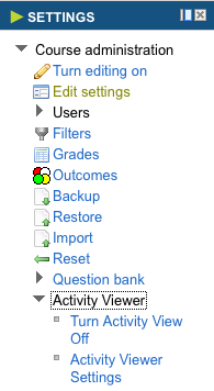
Norman (1993) reminds us that “We humans are spatial animals, very dependent upon perceptual information. Representations that make use of spatial and perceptual relationships allow us to make efficient use of our perceptual systems, to think experientially.” By using heat maps, it allows the lecturer to visualise student activity spatially within the real-world Moodle site itself, rather than through abstract graphs or tabular totals. This is not to say that graphs and tables are not valuable. The heat maps are just an alternate approach, and one that is more accessible to a broader cross-section of lecturers, as it easy to use and requires no training or guided instruction – it simply leverages our anthropological intuition. The screenshot (left) shows how the MAV can be switched on and off in the same way that Editing mode can be turned on and off – something even the complete Moodle novice quickly masters.
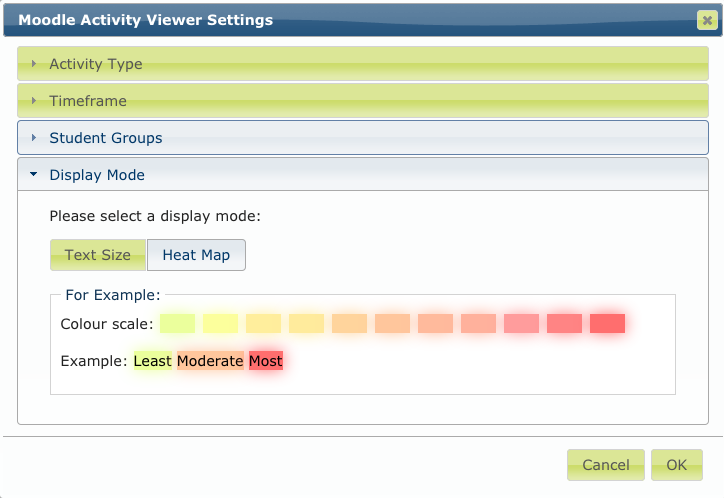
The tool presently has a modest list of configurable options, which it is planned to expand over time. This expansion will be balanced with the value of keeping the tool simple and focused on the tasks that lecturers wish to perform. At present, the options are largely focused on teacher reflection where lecturers are able to change the following properties of the representation:
- display count of clicks versus count of distinct students
- select specific weeks of the term for activity (incomplete)
- select specific groups within the class
- select either a heat map visualisation or a font size (think wordle or tag cloud) visualisation (for those with colour-blindness)
These options are changeable through the dialog (below) that is presented in the browser page, when the lecturer clicks on the Activity Viewer Settings option immediately beneath the on/off option in the settings menu (shown above).

- MAV Settings Dialog within Moodle Page – Display Mode
How is MAV Implemented?
In its present form, MAV has limited affordance for action. It like many other existing analytics tools focuses heavily on information, and not enough on supporting action. For MAV however, this is surmountable due to its technical architectural design, which is somewhat unusual. MAV is not implemented as a Moodle plugin on the Moodle server, but rather as a browser addon on the lecturer’s computer.

This browser driven approach is not new. SNAPP, a tool for conducting social network analysis within Moodle uses what’s called browser bookmarklets and has gained considerable popularity. Another approach more closely resembling MAV was taken by Leony, D. Pardo, L. et al. (2012) who created a browser addon that “talks” to a related server component sitting along side Moodle from which it retrieves analytics data, and is then “drawn” into the Moodle page as a graph in a custom block. To the viewer, the graphing block appears as a seamless part of the Moodle page, but in reality, the information has been synthesised between the analytics server and Moodle. MAV too has a server component that “talks” to a copy of the Moodle database and extracts statistics for display by the browser addon. Where MAV diverges from the approach of Leony, D. Pardo, L. et al. (2012) is that it is not focused on the conventional approach of using a Moodle course block to display information. Instead MAV treats the entire Moodle page as a canvas for conveying information, and in a way that is contextual to the canvas itself.
The problem with traditional Moodle plugin development is that “the LMS is commonly managed at an institutional level and it must support several courses, [and so] installing a customised module becomes a complicated procedure both technically and administratively.” (Leony, D. Pardo, L. et al., 2012) By using a browser addon and matching analytics server, “we simplify the task of providing visualizations to participants of the course, valuable for the execution pilot studies or the evaluation of visualizations.” (Leony, D. Pardo, L. et al., 2012)
This approach makes it easy to be agile and innovative without disturbing critical high-availability environments such as Moodle. If the browser addon breaks in someway, it is easily disabled in the browser settings restoring the default Moodle functionality. It is of course not without drawbacks. To name a couple, changes in Moodle are likely to break the Browser addon and there are sure to be variations to consider between Moodle versions. It is believed on the whole, that the advantages outweigh the disadvantages. This thinking will be tested over time.
MAV and Open Source
MAV is licenced under the GPL, and will be made available in the coming weeks via github. It is hoped that other educational institutions using Moodle may be interested in collaborating with the technology and the approach to refine and improve on the concept, and implement new ideas. Research is planned around its design and use. An announcement will be made when the source code is available and how people can get involved.
MAV in the Future
The following outlines a sample of ideas for MAV in the future.
Allow the lecturer to visualise the activity of individual students
As a scenario, consider an assignment extension request from a distance student. In evaluating the request, one of the things lecturers often consider is the amount of work the student has done leading up to the due date, offset by any mitigating circumstances that may have prevented such work. Using MAV, the lecturer could select this student through the MAV settings, and see how often the student has accessed relevant aspects of the course, when, and perhaps in what sequence. This would assist the lecturer in making an informed decision about the validity of the student’s extension request claims.
Provide affordances for action based on the analysed data within MAV and Moodle
As previously mentioned, MAV presently offers little in terms of affordance for action on the visualised student activity. One useful function supportive of teacher reflection would be to assist lecturers in capturing their reflections on their course sites while they view the heat maps. In the examples given at the start of this post, the lecturers were analysing the student activity and making decisions about how they might change their course in the next offering. What if lecturers could click on a resource that they wish to change in the future, and make notes within the Moodle site itself using MAV. The change and their thinking is captured immediately as they reflect, without having to venture somewhere outside of the Moodle site and thus breaking the natural flow of their reflective activity (Villachica, Stone & Endicott, 2006). A small icon could be attached to the resource or activity as a reminder that a change is to be made. Then when they need to update the course for the next offering, sometimes in a years time, the information is readily available and still in context of their course site.
Integrate contextual information in Moodle pages in other ways besides heatmaps
As an example, wherever a student name of number is displayed on a Moodle page, provide a hover menu or visual that provides additional information about the student. This could be things like their contact details and other info from their profile page. But it could also be a range of information from other sources (see next point). This also marks a shift from the low hanging fruit that is clickstream data to information that embodies more depth. As a contextual menu to each heatmap link, options could be provided to see a list of students who haven’t, and perhaps just as importantly have accessed a given resource. These students could then be contacted via mail merge either encouraging them to engage with the resource or activity, or praising them for doing so.
Using the browser addon architecture to integrate and aggregate other information services and data
The browser addons need not be limited to aggregating/synthesising information from only the server analytics component and Moodle. Opportunities exist to integrate MAV with other initiatives at my institution such as the Student Support Indicators Project (SSI). This integration can work in both directions. Identify using MAV which students have not made use of critical resources or participated in activities, and then look up their student success factors through the SSI. Similarly, on identifying a student within the SSI who is showing lower engagement with their course, redirect the lecturer to the Moodle course site with MAV switched on, and only showing the elements of the course used by the student, giving further detail to their behaviour.
References
Chatti, M. A., Dyckhoff, A. L., Schroeder, U., & Thüs, H. (2012). A reference model for learning analytics. International Journal of Technology Enhanced Learning, 4(5/6), 318. Retrieved from http://www.inderscience.com/link.php?id=51815
Leony, D., Pardo, A., Valentın, L. de la F., Quinones, I., & Kloos, C. D. (2012). Learning analytics in the LMS: Using browser extensions to embed visualizations into a Learning Management System. In R. Vatrapu, W. Halb, & S. Bull (Eds.), TaPTA. Saarbrucken: CEUR-WS.org. Retrieved May 25, 2013, from http://ceur-ws.org/Vol-894/paper6.pdf
Norman, D. A. (1993). Things that make us smart: defending human attributes in the age of the machine. Cambridge, Mass: Perseus. Reading, MA: Addison Wesley.
Villachica, S., Stone, D., & Endicott, J. (2006). Performance Support Systems. In J. Pershing (Ed.), Handbook of Human Performance Technology (Third Edit., pp. 539–566). San Francisco, CA: John Wiley & Sons.
